
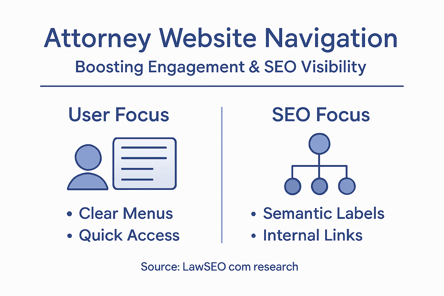
Every law firm website looks impressive until a potential client cannot find what they need. When visitors get lost in unclear menus or confusing links, they leave—taking valuable cases with them. For American law firms, website navigation is not just about style. It is the foundation for both client engagement and visibility on search engines. Clear, intuitive navigation connects prospective clients to your practice areas, attorney profiles, and consultation forms while supporting the technical needs of search engines and accessibility standards. This guide shows how the right structure can turn your site into your firm’s most effective client conversion tool.
Table of Contents
- Defining Attorney Website Navigation Essentials
- Navigation Structures For Legal Websites
- ADA Accessibility And Ethical Navigation Standards
- Optimizing For Mobile And AI User Experience
- SEO-Driven Navigation For Law Firm Visibility
- Common Navigation Mistakes And How To Avoid Them
Key Takeaways
| Point | Details |
|---|---|
| Intuitive Navigation is Crucial | Effective website navigation directly influences client engagement and SEO performance, guiding users quickly to the information they seek. |
| Structure Reflects Client Needs | Organize navigation based on clients’ search behaviors rather than internal firm structures to enhance discoverability and experience. |
| Prioritize Accessibility | Implementing accessible navigation not only complies with legal standards but also promotes inclusive access for all potential clients. |
| Mobile and AI Optimization is Essential | Ensure navigation functions smoothly on mobile devices and is comprehensible to AI crawlers for better visibility and user interaction. |
Defining Attorney Website Navigation Essentials
Attractive websites fail constantly. Not because of poor design or weak content, but because clients cannot find what they need. Website navigation is the foundational element that determines whether a potential client stays on your site or abandons it in frustration. Navigation encompasses all the menus, buttons, links, and interactive components that guide visitors through your firm’s digital presence.
For law firms specifically, navigation serves a dual purpose. It must be intuitive enough for clients who simply want to contact you about a specific legal issue, while also being structured clearly enough that search engines can crawl and understand your site’s organization. When prospects land on your attorney website, they should immediately understand where to go to learn about your practice areas, see attorney profiles, or request a consultation. This clarity directly impacts both user engagement and SEO performance.
Think of effective navigation as a roadmap. A prospective client searching for “divorce attorney in Minneapolis” may arrive at your services page, your about page, or a specific attorney profile depending on your site’s structure and how search engines categorize your content. The different navigation types serve distinct purposes: global navigation at the top provides access to major sections like practice areas and attorneys, breadcrumb trails show users where they are within your site hierarchy, and footer navigation captures visitors before they leave. A well-organized site also uses semantic HTML navigation elements that help both assistive technologies and search engine crawlers understand your site’s structure, which indirectly supports your SEO efforts.
Your navigation structure should reflect how potential clients think about legal services, not internal firm organization. A client doesn’t care that you have separate criminal defense and white collar crime departments. They search for “criminal defense attorney” or “DUI lawyer,” so your navigation should mirror those search patterns. This alignment between navigation structure and real search behavior makes your site discoverable while simultaneously improving user experience. When visitors can find answers quickly, they spend more time on your site, which search algorithms recognize as a positive signal.
Pro tip: Audit your navigation by placing yourself in a prospective client’s shoes: if you needed help with a specific legal issue, could you find the right information within two clicks? If not, your navigation structure needs refinement.
Navigation Structures for Legal Websites
Not all navigation is created equal. A solo practitioner handling personal injury cases needs a different structure than a 50-person firm with 12 practice areas and multiple office locations. The navigation architecture you choose directly influences how search engines understand your site and how quickly clients find what they need. Three primary structures dominate legal websites, and each serves different firm sizes and specializations.
Hierarchical navigation works from general to specific, moving prospects from broad topics like “practice areas” down to individual attorney profiles, case results, or service details. This structure mirrors how potential clients think about legal problems. Someone searching for estate planning doesn’t care about your criminal defense team. With hierarchical navigation, they can drill down from “estate planning” to “probate services” to “guardianship planning,” encountering increasingly specific information with each click. Global navigation at the top provides access to your main sections, while side navigation menus support deeper exploration within each practice area, allowing users to navigate through legal content without getting lost.
Contextual and local navigation types work together to guide visitors through related information. Contextual navigation appears within content itself—links within an article about “DUI penalties” might point to “license suspension timelines” or “sentencing guidelines.” Local navigation exists within a section, like a sidebar showing all criminal defense topics. Many firms struggle here because they treat practice areas as isolated islands rather than connected resources. If a visitor lands on your “business formation” page, contextual links to “employment law,” “contract review,” and “liability protection” keep them exploring your firm’s broader capabilities. This interconnected approach improves user engagement while also helping search engines understand relationships between your legal content areas.
The practical reality: most successful legal websites combine these structures. Your main menu uses hierarchical organization, side navigation handles sub-sections, and contextual links appear within content. Search engines recognize this comprehensive navigation system as a sign of site maturity and clear organization, which indirectly supports SEO performance. Mobile users especially benefit from this layered approach, where they can access main sections quickly but still drill into detailed information without endless scrolling.
Pro tip: Map your firm’s practice areas and service offerings on paper before building navigation, ensuring each section has no more than three levels of depth—anything deeper forces users to hunt for information instead of finding it.
Here’s a comparison of core navigation structures for law firm websites:
| Structure Type | Best For | Key Benefit | Potential Drawback |
|---|---|---|---|
| Hierarchical | Large/multi-specialty firms | Offers clear paths to deep content | Can be complex if too many levels |
| Contextual | Content-rich sites | Keeps users exploring related topics | Risk of user getting distracted |
| Local/Sectional | Niche or solo practices | Easy access to related subpages | May create isolated information |
ADA Accessibility and Ethical Navigation Standards
Your website navigation can become a barrier or a bridge. For law firms, this distinction carries real consequences. Roughly 15 percent of the United States population experiences some form of disability, and many potential clients with visual impairments, motor difficulties, or cognitive challenges simply cannot use poorly designed navigation. Beyond the moral obligation lies a legal one: the Americans with Disabilities Act (ADA) and related accessibility standards apply to attorney websites, making accessible navigation a compliance requirement, not a nice-to-have feature.
Accessible navigation starts with fundamental practices that benefit everyone. Keyboard navigation and screen reader compatibility mean users can traverse your site without a mouse, using only their keyboard or assistive technology. This requires proper semantic markup, descriptive page titles, and accurate heading hierarchy. Someone using a screen reader shouldn’t hear “click here” or “read more” as link text. Instead, links should be specific: “personal injury case results” or “schedule a consultation with our estate planning attorney.” The difference is invisible to sighted users but essential to those relying on assistive technology. When your navigation uses standard links and proper HTML structure, you’re meeting accessibility standards while also helping search engines understand your site organization.
Ethical navigation design goes beyond compliance checkboxes. It reflects your firm’s values. When you design navigation that serves clients with disabilities as well as those without, you expand access to legal information for people who might otherwise be left out. Navigation designed for accessibility ensures all users can traverse pages easily, promoting equity in how legal services are discovered and accessed. Consider contrast ratios on your menu items, text sizing options, and logical tab order through navigation elements. Many of these improvements simultaneously improve mobile usability, which benefits your entire client base.
The practical implementation involves regular testing. Run your site through accessibility checkers, test with keyboard navigation only, and if possible, have someone using a screen reader review your site. Look for missing alternative text on navigation icons, improper heading sequences, or color as the only way to distinguish menu states. These issues compound across your entire site and create genuine barriers to access. Your navigation is often the first interaction a prospect has with your firm. Making it accessible demonstrates that you care about serving all clients, not just the easiest ones to reach.
Pro tip: Conduct a keyboard-only navigation test: visit your site and navigate using only the Tab, Enter, and arrow keys for five minutes to identify accessibility gaps your sighted users never encounter.
Optimizing for Mobile and AI User Experience
Mobile traffic now represents over 60 percent of all website visits for law firms. Yet many attorney websites still feel like desktop designs squeezed onto smaller screens. Your navigation must work flawlessly on phones, tablets, and emerging AI interfaces that prospective clients use to find legal help. The stakes are higher than user convenience. When someone on their phone cannot navigate your site or find your phone number, they move to a competitor who made mobile easy.

Mobile navigation requires different thinking than desktop design. Hamburger menus collapse complex navigation into a single toggle button, freeing screen space for content. Touchable elements need proper spacing so users don’t accidentally tap the wrong link. Text should scale automatically without requiring users to pinch and zoom. Navigation patterns friendly to smartphones include simplified menus and swiping gestures that feel native to mobile devices. Breadcrumb trails become critical on mobile because users lose orientation quickly on small screens. Someone researching “medical malpractice settlements” needs to understand exactly where they are and how to get back to your main practice areas. Your mobile navigation should answer these questions instantly, without requiring users to think.
AI assistants and chatbots represent the new frontier. When a prospective client asks ChatGPT “who is the best DUI attorney in Denver,” your firm’s name either appears or it doesn’t. AI systems scan websites for clear, well-organized content and proper navigation structure. A disorganized site with buried practice areas and confusing menus registers poorly in AI systems. Global navigation with clear categorization and consistent structure across devices signals to AI that your firm is legitimate and well-organized. Ensure your navigation uses semantic HTML headings, descriptive link text, and logical hierarchy. When AI crawlers encounter structured, intuitive navigation, they extract information more accurately and are more likely to reference your firm in responses to potential clients.
The convergence of mobile and AI optimization means your navigation serves multiple audiences simultaneously. A human user on a phone needs quick access to your contact information and practice areas. An AI crawler needs semantic clarity and logical organization to understand your content. The good news: fixing navigation for mobile almost always improves AI discoverability. Clear, accessible navigation benefits everyone, whether they’re using fingers, keyboards, screen readers, or AI agents looking for legal expertise.
Pro tip: Test your navigation on actual mobile devices using your thumb to tap links from across the screen—not just tapping in the center—to catch spacing and sizing issues that desktop testing misses.
SEO-Driven Navigation for Law Firm Visibility
Search engines are essentially information architects. They crawl your site structure, read your menu labels, and assess how logically your content is organized. Your navigation isn’t just for human visitors. Every link, every label, and every hierarchy level communicates something to Google and other search engines about what your firm does and what services matter most. When navigation is sloppy, search engines struggle to understand your site’s topical focus. When it’s strategic, you get ranked for the legal services that actually generate revenue.
The connection between navigation structure and SEO rankings is direct. A law firm with practice areas labeled generically as “Services” or “Areas” sends weak signals to search engines. By contrast, a firm with clear navigation categories like “Personal Injury Settlement Negotiations,” “DUI Defense,” and “Family Law Mediation” immediately communicates topical authority to search algorithms. Clear, descriptive navigation labels improve how search engines crawl and understand website structure, directly impacting indexation and visibility. Your most important practice areas should live at the top level of navigation, not buried three clicks deep. If estate planning generates your highest revenue, it should be visible in your main menu, not hidden under a generic “practice areas” dropdown. This prominence tells search engines what matters to your firm.
Semantic HTML markup amplifies navigation’s SEO power. When you use proper semantic menu markup and clear labeling with HTML5 elements, search engines extract meaning more accurately. Using descriptive anchor text in navigation links, implementing schema markup, and organizing your information architecture around keyword themes creates compounding SEO benefits. A well-structured navigation that reflects your keyword strategy means someone searching for “probate attorney” finds your probate page quickly, stays on your site longer, and search engines recognize the topical relevance. These user engagement signals feed back into rankings.
The strategic approach aligns navigation with actual client search behavior and your firm’s business goals. Research your target keywords, then structure navigation around them. If your firm specializes in construction defect litigation, make that a primary menu item rather than grouping it under “commercial litigation.” Include keyword-relevant anchor text in your navigation. This isn’t about keyword stuffing. It’s about using the most accurate, descriptive language that also happens to match what prospective clients search for. When navigation structure mirrors search intent, you get compounding benefits: better user experience, improved search engine understanding, and higher visibility for the services that matter most to your bottom line.
Pro tip: Conduct a competitive navigation audit by visiting the top three ranking sites for your key practice areas, noting how they organize menus and label primary categories, then optimize your own navigation to compete directly for those keyword-driven organizational patterns.
Common Navigation Mistakes and How to Avoid Them
Most navigation problems don’t happen overnight. They accumulate gradually as your firm grows, adds practice areas, and tries to accommodate every possible client need. A firm that started with five practice areas suddenly has fifteen, and the navigation buckles under the weight. Understanding the most common mistakes helps you avoid the expensive redesigns that come later when poor navigation costs you clients and search rankings.
The depth trap is the most frequent culprit. Law firms create menus within menus within menus, forcing users to click through four or five levels to reach actual content. Your contact page shouldn’t require navigating through “About” to “Locations” to “Contact Information.” Every click adds friction. Studies show engagement drops significantly after three clicks. A prospective client hunting for your phone number will abandon your site long before finding it. Avoiding overly deep menu hierarchies and excessive links prevents confusion and improves usability. The solution is ruthless prioritization. Limit your main menu to five to seven items maximum. Combine related practice areas instead of creating separate menu items for each minor specialization. Move less critical information like office photos or firm history to footer links where they don’t clutter primary navigation.
Another critical mistake involves vague labeling. Menu items like “Services,” “Practice Areas,” or “More” tell visitors nothing. Someone searching for “probate attorney” sees these labels and has no idea if probate services are even available. Non-descriptive page titles and unclear headings hinder navigation for all users, particularly those using screen readers or scanning quickly. Use specific, keyword-rich labels instead. “Estate Planning and Probate” beats “Services.” “Criminal Defense” beats “Practice Areas.” These descriptive labels help both human visitors and search engines understand what you offer.
Testing your navigation with real users reveals problems you’ll never catch internally. You built the site. You know where everything lives. A prospect doesn’t. Watch someone try to find your criminal defense practice area, schedule a consultation, or locate your phone number without your guidance. Where do they struggle? Where do they look first? This feedback is invaluable. Many firms also skip accessibility testing, creating navigation that works for mouse users but fails for keyboard navigation or screen reader users. This limits your audience and creates legal exposure. Test navigation on multiple devices, in different browsers, and with assistive technologies. If someone can’t navigate your site because your menu uses JavaScript instead of standard HTML links, you’ve created a barrier.
Pro tip: Use a five-click maximum rule: any piece of important content should be reachable within five clicks from your homepage, testing from multiple entry points and devices to ensure consistency.
Below is a summary of top navigation mistakes and the risks they pose:
| Mistake | User Impact | SEO/Compliance Risk |
|---|---|---|
| Excessive Menu Depth | Visitors abandon site | Poor crawlability, lower rankings |
| Vague Menu Labels | Users can’t find key services | Undervalued pages by search engines |
| Ignoring Accessibility | Excludes disabled users | Potential legal liability, loss of audience |
| Lack of Real-World Testing | Hidden usability problems | Broken experience on non-standard devices |
Transform Your Law Firm Website Navigation and Unlock Higher Engagement
Struggling with complex navigation that drives potential clients away or confuses AI search tools? This article highlights critical issues like excessive menu depth, vague labels, and accessibility gaps that can silently erode your firm’s online visibility and client trust. Your website navigation must speak your clients’ language and align with their search intent while meeting ADA accessibility standards and optimizing for mobile and emerging AI-driven platforms.
At LawSEO.com, we specialize in crafting navigation structures that reflect how your prospective clients think and search. Our comprehensive SEO services combine hierarchical menus with contextual and local navigation enhancements to create intuitive user journeys. We emphasize ethical, accessible navigation design that not only complies with legal requirements but also boosts your rankings on Google and AI-driven search engines. Don’t let confusing navigation block your growth.
Take the first step toward transforming your law firm’s digital presence. Explore how our expert SEO strategies can make your website easier to navigate, more visible, and ready for the future of legal marketing. Act now and give your clients the seamless experience they deserve while gaining a powerful edge over competitors.
Frequently Asked Questions
How important is website navigation for law firms?
Effective website navigation is crucial for law firms as it helps potential clients find the information they need quickly, improving user experience and engagement.
What are the best practices for structuring law firm website navigation?
Best practices include using hierarchical navigation, employing contextual links within content, and ensuring mobile-friendliness for easy access across devices.
How can website navigation affect SEO for attorneys?
Clear, descriptive navigation helps search engines understand the site’s structure and content, which can enhance indexation and improve visibility for targeted keywords.
What is the significance of accessibility in attorney website navigation?
Accessible navigation ensures that all users, including those with disabilities, can easily navigate your site, meeting both ethical and legal standards while broadening your potential client base.
