
TL;DR:
- Most law firm websites fail to provide a clear, fast, and user-friendly experience needed to convert visitors.
- Streamlining navigation, enhancing content clarity, and ensuring accessibility can significantly increase client inquiries.
- Regular UX reviews and improvements are essential for legal SEO success and legal compliance.
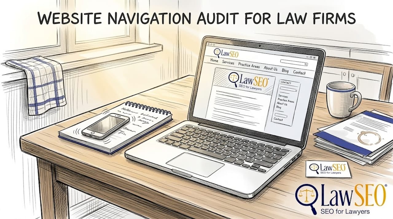
A prospective client finds your law firm through a Google search, clicks your website, and within seconds faces a cluttered menu, tiny text on their phone screen, and no clear way to contact you. They leave. That lost visitor may have been your next major case. Law firm websites with streamlined user experiences convert more online visitors into clients, yet most firms still treat their website as a digital business card rather than a client acquisition engine. This guide gives you field-tested, actionable steps to evaluate your current site, fix what’s broken, and build a user experience that turns visitors into paying clients.
Key Takeaways
| Point | Details |
|---|---|
| Audit current UX | Regularly assess your law firm website’s user experience to catch and fix barriers that drive clients away. |
| Simplify navigation | Streamlined menus and internal links help visitors find information quickly, leading to higher engagement and inquiries. |
| Build trust with content | Clear, client-focused information and prominent trust signals like testimonials increase credibility and conversion. |
| Ensure accessibility | Accessible, mobile-friendly sites avoid legal risks and make your services available to every prospective client. |
Assess your current law firm website UX
Before you can fix anything, you need to know exactly what’s failing. A clear user experience audit can reveal critical barriers to client conversion that you may not even notice when you visit your own site every day. Familiarity breeds blindness. You need a structured approach.
Start by evaluating your site against the core UX criteria that matter most for legal practices:
| UX Criteria | What to Look For | Common Problem |
|---|---|---|
| Navigation | Clear menus, logical page hierarchy | Too many links, buried contact page |
| Page speed | Load time under 3 seconds | Oversized images, outdated plugins |
| Content clarity | Plain language, client-focused copy | Legal jargon, attorney-centric writing |
| Accessibility | Alt text, contrast ratios, keyboard nav | Missing labels, low-contrast text |
| Mobile experience | Responsive layout, tappable buttons | Desktop-only design, tiny form fields |
Most legal practice sites share a predictable set of pain points. Attorney bio pages often read like resumes rather than trust-building introductions. Contact forms ask for too much information upfront, creating friction right when a prospect is ready to reach out. Practice area pages bury the actual services under lengthy firm history paragraphs.
To conduct your own basic walkthrough, follow these steps:
- Homepage: Does it immediately communicate who you serve, what you do, and how to contact you? Time yourself. If it takes more than five seconds to understand the firm’s focus, it’s too slow.
- Main navigation: Can a first-time visitor find your practice areas and contact page in one click? Test this with someone unfamiliar with your site.
- Attorney bio pages: Do they address client concerns, or do they simply list credentials? Prospective clients want to know you understand their problem.
- Contact forms: Count the fields. Every unnecessary field reduces submission rates. Ask only for what you need to make initial contact.
For a deeper look at law firm website conversion, map out the path a visitor takes from landing on your homepage to submitting a contact form. Every extra click or confusing step is a drop-off point.
Pro Tip: Test your website on both desktop and mobile devices at least once a month. Use a phone you don’t normally use, since your own device may cache a faster version of your site than what new visitors actually experience.
Streamline website structure and navigation
Once you’ve audited your site, the next crucial focus is making your content and services easy to navigate. Improved navigation directly increases both user engagement and SEO results for attorneys. These two outcomes are not separate goals. They reinforce each other.
Here’s a direct comparison of poor versus optimal navigation in law firm websites:
| Navigation Element | Poor Approach | Optimal Approach |
|---|---|---|
| Menu structure | 12+ top-level items | 5-7 focused categories |
| Practice area pages | One long page listing all areas | Individual pages per practice area |
| Contact access | Footer only | Sticky header with phone number |
| Internal links | Minimal cross-linking | Strategic links guiding users deeper |
| Mobile menu | Horizontal scrolling tabs | Collapsible hamburger menu |
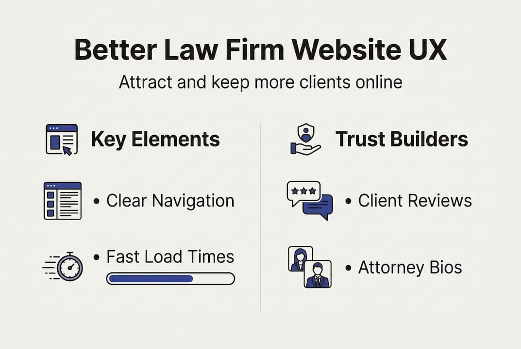
A client-focused navigation menu should include these essentials:
- Practice areas: Each major service area deserves its own clearly labeled menu item and dedicated page.
- Attorney profiles: Make it easy to find the person who will handle a case. Clients hire attorneys, not firms.
- Resources or blog: A content hub signals expertise and keeps visitors on your site longer.
- Contact page: This should always be one click away from any page on the site.
- Testimonials or results: Social proof belongs in your navigation structure, not buried at the bottom of a homepage.
Internal linking is often underused on legal websites. When a visitor reads your personal injury practice area page, a contextual link to your case results page keeps them engaged and builds trust. For user experience on legal websites, think of internal links as guided pathways. You are directing a visitor through a logical sequence that ends at a contact form.
Strong internal linking also distributes SEO authority across your site, helping more pages rank in search results and supporting boosting online client acquisition through organic traffic.
Pro Tip: Limit your top-level navigation to seven items or fewer. Research on cognitive load consistently shows that more choices lead to decision paralysis. Make it easy for a stressed, time-pressed person to find what they need fast.
Enhance content clarity and trust signals
After making your website easier to use, the next essential improvement involves building authority and credibility with potential clients. Even a perfectly structured site will fail to convert if the content itself doesn’t inspire confidence.
Follow these steps to revise your content for clarity:
- Eliminate legal jargon. Replace terms like “tortfeasor” or “subrogation” with plain descriptions. Write as if explaining the situation to a friend who has never hired an attorney.
- Lead with client needs. Start every practice area page by describing the client’s problem, not the firm’s history. “Facing a DUI charge can cost you your license, your job, and your freedom” speaks directly to a prospect’s fear.
- Use bullet points and short paragraphs. Dense blocks of text cause visitors to skim past critical information. Break content into scannable sections with clear subheadings.
- Add specific calls to action. “Call now for a free consultation” outperforms “Contact us” every time. Be specific about what happens next.
- Update content regularly. Stale blog posts and outdated case results signal neglect. Fresh content signals an active, attentive firm.
Trust signals are equally important. Law firm websites with clear, authoritative content and trust signals retain more visitors and convert at higher rates. The trust elements that matter most include:
- Client testimonials with specific outcomes, not generic praise
- Industry memberships and bar association badges
- Case results presented with context, not just dollar amounts
- Multiple contact options: phone, email, and live chat where possible
- Professional photography of attorneys and office spaces
“Credibility is built in seconds online. A potential client who sees a professional photo, a recognizable bar association badge, and a genuine client review will stay on your site far longer than one who sees a stock photo and a generic tagline.”
Consistent branding reinforces trust. Your website design for attorneys should use a cohesive color palette, consistent fonts, and a visual style that communicates professionalism. Mismatched design elements, even subtle ones, erode confidence. Your website conversion guide should treat visual consistency as a non-negotiable baseline.
Prioritize accessibility and mobile responsiveness
Solid UX means every potential client can use your site with confidence, regardless of ability or device. This is not optional. Accessibility is a legal requirement and an SEO differentiator for law firms, and the consequences of ignoring it extend beyond lost clients.
Several attorneys and law firms have faced lawsuits under the Americans with Disabilities Act for maintaining inaccessible websites. Courts have increasingly ruled that websites qualify as “places of public accommodation” under the ADA. A firm that defends others’ rights while maintaining an inaccessible website faces obvious reputational and legal risk.
The top accessibility features your site must include:
- Alt text for all images: Screen readers rely on descriptive alt text to convey visual content to users with visual impairments.
- Keyboard navigation: Every interactive element, including menus, forms, and buttons, must be operable without a mouse.
- Sufficient color contrast: Text must meet WCAG 2.1 contrast ratio standards. Light gray text on a white background fails this test.
- Readable font sizes: Body text should be at least 16px. Smaller text forces users to zoom, creating a poor mobile experience.
- Mobile-friendly buttons: Touch targets should be at least 44×44 pixels so they’re easy to tap on a phone screen.
- Descriptive link text: “Click here” tells a screen reader nothing. “Schedule a free consultation” is clear and actionable.
Responsive design also directly affects your search rankings. Google uses mobile-first indexing, meaning it evaluates the mobile version of your site when determining where you rank. A site that looks great on a desktop but breaks on a phone will rank lower, regardless of content quality. For user experience and legal SEO, mobile performance is inseparable from search visibility.
Pro Tip: Use Google’s free PageSpeed Insights and the WAVE accessibility checker regularly. Both tools flag specific issues with clear explanations, so you don’t need a developer to understand the problems. Fix the critical issues first, then work through the warnings.
Our perspective: Why effective UX is the legal marketing advantage most law firms ignore
Here’s an uncomfortable truth we’ve observed across hundreds of legal marketing campaigns: most law firms pour budget into driving traffic while ignoring what happens after a visitor arrives. They invest in SEO, pay-per-click ads, and billboard campaigns, then send prospects to a slow, confusing, or visually outdated website. It’s like filling a leaky bucket.
The firms that see the most dramatic lead increases are rarely the ones that doubled their ad spend. They’re the ones that fixed their contact forms, simplified their navigation, and added genuine client testimonials. Simple changes. Measurable results.
There’s also a persistent misconception that a “flashy” website equals a user-friendly one. Animated headers and elaborate graphics often slow page load times and distract from the one action you want visitors to take: contacting you. The best-performing legal websites we’ve worked with are clean, fast, and relentlessly focused on the client’s next step.
Legal SEO and user experience are not separate disciplines. They are two sides of the same coin. UX improvements compound over time, building a site that ranks better, converts more visitors, and earns client trust before a single word is spoken. That’s a lasting competitive edge, not a one-time project.
Ready to transform your law firm website UX?
Investing in modern website UX is one of the highest-return decisions a law firm can make in 2026. Every improvement you make to navigation, content clarity, accessibility, and mobile performance directly increases the number of visitors who become clients. At LawSEO, we specialize exclusively in legal digital marketing, offering UX audits, website redesigns, and full law firm SEO strategy integration. Our team includes some of the best web designers for law firms in the industry, all focused on one goal: helping your firm attract and convert more clients online. Let’s build a website that works as hard as you do.
Frequently asked questions
What are the most important UX elements for a law firm website?
Clear navigation, persuasive and easy-to-read content, trust signals like testimonials, and mobile accessibility are the most critical elements. Legal websites require exceptionally clear navigation and content clarity to keep prospective clients engaged.
How does better UX directly impact client acquisition for lawyers?
Improved user experience removes friction from the path between a website visit and a client inquiry, raising your conversion rate and the quality of leads you receive. Improved UX equals higher client conversion rates across legal practice areas.
Is website accessibility a legal requirement for law firms?
Yes, many attorneys are now legally required to meet accessibility standards under the ADA and face penalties for non-compliance. Website accessibility is a legal necessity for many firms and also improves search rankings.
How often should a law firm review its website UX?
At minimum, review your website UX every 6 to 12 months, or sooner when technologies, regulations, or client expectations shift significantly. Rapid changes in mobile device usage and search engine standards make regular reviews essential.
Can improved UX boost law firm SEO?
Yes, search engines reward user-friendly, accessible sites with better rankings, which drives more organic visitor traffic. User experience enhancements drive both SEO performance and lead generation simultaneously.
